2014 Mercedes-Benz S-Class
I was ready to write a post all about how pedestrian safety laws are killing the fun for automotive designers, and why the situation is compounded by newly emerging aesthetics and modes of driving among elite Chinese motorists. Then I had a surprising conversation (and then a revelation) with Daimler-Benz’s Robert Lensik, the designer in charge for the new Mercedes-Benz S-Class.
First let me untangle what I mean in regards to 1) pedestrian safety laws, and 2) the “Chinese aesthetic.” This will be fun I promise (but please send me an email to the contrary should I bore you to tears).
1) Pedestrian safety seems absurd at first, but then upon reconsideration the absurdity stems instead from not taking the topic seriously much sooner. Safety belts, airbags, crumple zones and deformable bumpers are all about transferring the energy of a crash away from the people inside the car, but what happens to people when struck by the car? This question’s been brought to the fore in recent years by the increasing population density in urban city centers both in Western Europe and particularly China - where motoring is relatively new to the masses and pedestrian injuries and death due to car crashes are high. Newly instated global mandates require a cushion of space and deformable materials (such as plastic) to surround the engine and thereby soften the blunt force of its impact to a pedestrian during a frontal collision: the angle between the hood and windshield is engineered to decrease the likelihood that the victim continues their unexpected journey over the roof of the car to potentially be injured yet again. Makes good sense, right?
However the immediate impact of pedestrian safety mandates to styling has been pleasant as the aforementioned blow to the head. This cushion of space surrounding the engine forces a taller profile at the front of the car (where most cars have their engine), and creates more surface area across the nose which automakers must figure out how to disguise. Most are masking this problem area with larger grilles, air intakes and headlights of varying shapes and sizes, and with varying degrees of aesthetic success. Due to these uniform safety laws, cars are beginning to look more or less uniform in their design, with blunt, stubby noses and gaping expressions from their upright grilles. At first this “new car face” seemed bold and refreshing, but now that everyone has it, the novelty is wearing thin: like a cosmetic surgeon whose work is undetectable until you see three or four of his celebrity patients side by side, revealing the telltale sameness resulting from his scalpel and particular preference for collagen or fillers.
2) Now to the “Chinese aesthetic.” A car’s face - anthropomorphically speaking - consists of headlamps (or some say the windshield) for eyes, a radiator for the nose, and the bumper area for the mouth. Newly affluent Chinese consumers want luxury cars that convey power and status with bigger, more expressive“ faces ” than in the West (see this report from Dan Neil at The Wall Street Journal last year which speaks more to this ). Further conveying prestige, they also prefer to leave driving duties to the chauffeur seated up-front while they pilot more global destinies from their Wifi-enabled mobile offices in the rear. Doesn’t this new future of “mogul-motoring” (my words) -- a mindset that is largely shared by Russia and the far-East -- seem terribly old-fashioned, terribly… “Gatsby”? Isn’t this exactly what folks like J.D. Rockefeller, J.P. Getty and F.W. Woolworth wanted from their Packards, Pierce Arrows, Duesenbergs, Rolls-Royces and Bentleys? As capitalism and wealth explodes in China – as it did in the USA from the late 20s through the mid-50s - doesn’t that make perfect sense?
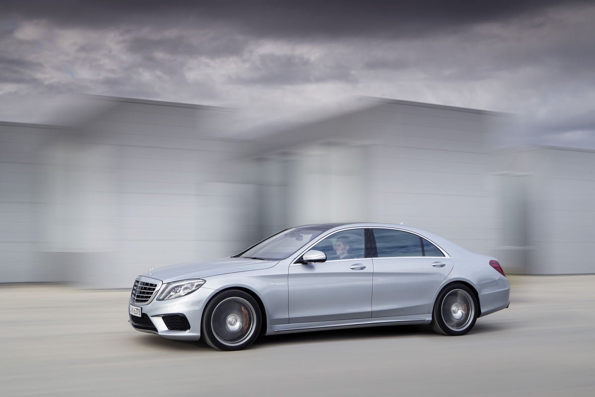
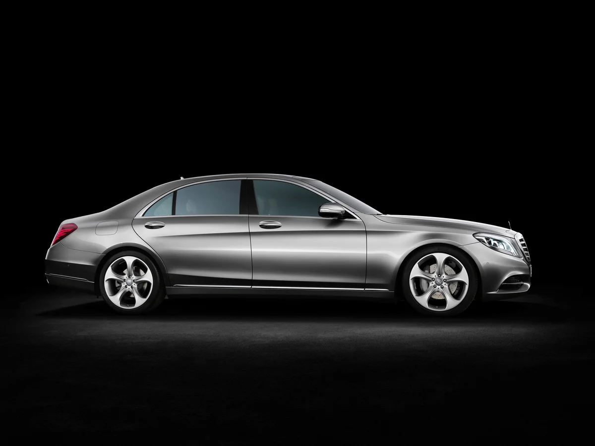
This logic crystallized during my conversation with Lensik about the design of the new S-Class, the sheet metal of which hangs from Mercedes’ “Dropping Line,” which the automaker says is an homage to the classic elegance of its 1930s (i.e. Gatsby) cars. A crease in the car’s flanks that descends from front to rear, the Dropping Line visually draws the S-Class forward by its nose, which is a major break from tradition. Since the mid 70s, cars have emulated the “wedge” shape, slicing forward with sleek low noses, and finishing with high, often chunky trunks and rears. Conversely, the S-Class leads with the blunt end of the wedge – namely its tall, newly upright nose and radiator - concluding with its svelte, low and tapered rear. The automaker's CLS, CLA, and A-Class models share this design motif.
Continuing Mercedes' long lineage of "Dropping Lines": 1961 Mercedes-Benz 300 D Adenauer Cabriolet (image courtesy of Gooding and Company)
So why is Mercedes flipping the script, and the wedge? Because the Dropping Line is an ingenious, elegant solution that kills three birds with one stone. First it rekindles the aesthetic of a bygone era of powerful, grand and decadent cars that are the perfect fit for elite Chinese buyers. Second it shifts the orientation of the car to the nose, creating the perfect place to hide the taller profiles now mandated by pedestrian safety.
1954 Bentley R-Type Continental Fastback, with its own grand "Dropping Line" (image courtesy of Gooding & Company/Mike Maez)
And third, the silhouette mirrored by the Dropping Line is closest to aerodynamic perfection, as discovered way back in 1920 by the pioneering engineer, Paul Jaray. I learned this from the phenomenal book “Car Design Europe: Myths, Brands, People” by acclaimed scholar and weekly Handelsblatt columnist Paolo Tumminelli. I’ll explore this topic together with Mr. Tumminelli, who I’m thrilled to be interviewing shortly, in an upcoming post. (PLEASE CLICK HERE FOR THAT INTERVIEW)
An original line-dropper: 1937 Mercedes-Benz 540K Special Roadster (image: RM Auctions)


